
Sticky Footer Layout
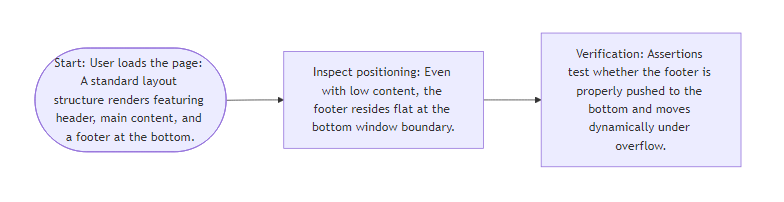
How often have you seen a website footer floating in the middle of a blank page because the content was too short? The Sticky Footer Layout is a classic CSS layout challenge. The goal is simple: ensure the footer stays at the very bottom of the screen when there is little content, but flows naturally at the end of the document if the content overflows the fold.
In modern CSS, this is best achieved using Flexbox or CSS Grid, avoiding fixed positioning hacks that cover content. The trick is to make the page wrapper take at least the full viewport height using min-height: 100vh, then let the main content area expand with flex: 1 to push the footer down.
Your page should have three sections: a header at the top, a main content area in the middle, and a footer element with ID #layout-footer at the bottom. Use flexbox on the body or a container so the main area stretches to fill the gap, keeping the footer firmly at the bottom when content is short but allowing it to scroll naturally when content is long.
Algorithm Flow
Best Answers
Solutions Coming Soon
Verified best solutions for this Challenge are still being analyzed and will be available soon.
Comments (0)
Join the Discussion
Share your thoughts, ask questions, or help others with this Challenge.